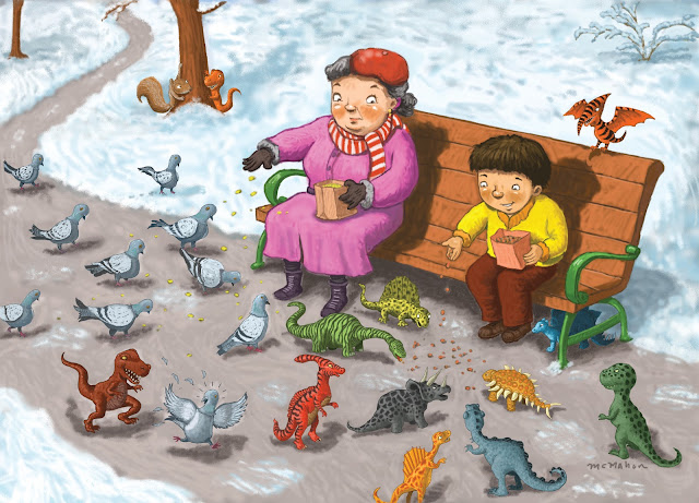
Well, it’s time to do a mailer promo piece again and this time I decided to do something a little different with the imagery.
Putting out a mailer is difficult because you have to keep in mind that the editor or art director who’s looking at the card is going to look at it for about three seconds or so before they A: pin it up on their bulletin board for future reference or B: toss it in the circular file because it isn’t relevant to any current or future projects they might be working on. As an illustrator you figure that pretty much 95 percent of your beloved postcards are going into the trash. That’s not being pessimistic, that’s just the way it is. So whatever you send better be darned interesting.
Starting off, I had this image that flashed into my head of a boy feeding dinosaurs at the park. What it needed was someone to react to this bizarre scene so I imagined a woman, looking a bit alarmed, feeding pigeons sharing a park bench with the boy.
Here’s my first sketch of the idea. Done quickly, I just wanted to get the image out of my head and down on paper…or the computer screen as I use program Corel Painter 12 from sketch to completion for all my art.
 |
| First try vertical format |
Somehow the vertical format just wasn’t working so I tried doing the sketch horizontally. Compositionally this seemed to work out better and made it not so cramped looking.
Originally I had the perspective drop off so you could see the end of the park with trees and the city in the background, but I wanted to focus the attention on the woman, boy and dinosaurs so I made it a winter scene and cropped in on the main characters.
 |
| Sketch version with city in background |
At first I thought that would do an ink line version and then do the color on the layer underneath, like painting animation cells. I think the ink line version looks pretty good actually and I loved using the dry ink pen in Painter 12.
 |
| Ink line version |
But in the end I decided to make it look like a painted piece using Painter’s Artist Chalks. I tried make this art look more painterly and less digital by not using most all of the layers and digital effects in Painter 12. I’ve found that by doing this it gives the artwork a nice naturally painted feel to it. Since nobody really knows how the dinosaurs looked and what kind of coloration they had, I could really use my imagination and try to create some fun creatures there. The pigeons, honestly, were not as much fun to do, but at least I tried to give them some character.
Here is the finished art, ready for my postcard and website.


